Web design is increasingly focused on a good user experience (and rightly so). But because of this, the pressure is on designers to create the most usable and attractive websites. By carefully applying minimalist principles, designers can create attractive and effective websites without a lot of elements and increase conversions on your website thanks to a better user experience.
In this article, we describe why you should consider the principle of "less is more" when it comes to your website.
Minimalist web design is a pre-existing technique that has been redeveloped for modern web design. This design became popular due to the increasing complexity of Web sites. The more elements a web design has, the more complex it appears to a user. This has a negative effect on the user experience.
If you apply minimalism properly, you can ensure that the design simplifies users' actions. A study by EyeQuant shows that a quiet design results in a lower bounce rate. A minimalist design also offers as additional benefits: faster load times and better compatibility between different screen sizes.
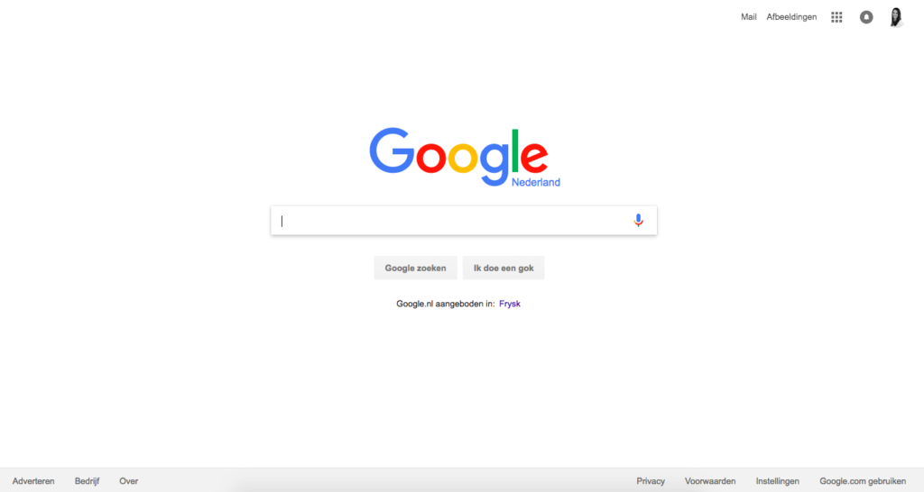
One of the most famous examples of minimalist web design is probably Google Search. Several years ago, they chose to make the home page as simple as possible. All unnecessary elements have been removed, the search function is completely central.
The power of minimalism lies in removing elements and content that do not support conversions. You simplify the interface. The designer and marketer must carefully determine which elements should be prioritized. Only the most important elements that contribute to conversions should be displayed. Anything that distracts the user should be removed (e.g. unnecessary images that do not contribute to the ultimate goal). The goal of your web design is to make the path to conversion clearer and not create confusion.
In a minimalist design, every detail should have a meaning/purpose. These visual features are definitely in an effective minimalist web design:
White spaces are the power of minimalist design. White spaces between visuals create more emphasis on the existing elements.
Although we call white space, white space ... it doesn't necessarily have to be white. Some Web sites use full-color backgrounds precisely to make a white element stand out.

Source: Bouguessa
With a minimalist interface, you often use flat textures, icons and graphics. Flat interfaces do not use highlights, shadows, gradients or other textures that make the user interface shiny or 3D.
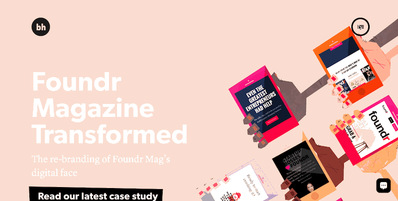
Images stand out best in a minimalist design. They create an emotional connection and atmosphere. However, this must be in line with the principles of minimalism. A busy photo is distracting, ruining the benefits of a minimalist interface.
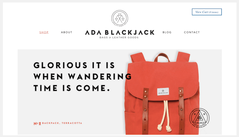
Source: Ada Blackjack)
Color has great potential to create both informative and emotional connections between product and user. Color immediately grabs visitors' attention without additional elements and images. Designers often tend to use multiple colors, but it is not at all crazy to use only one color.

Source: Mixd
In addition to color, typography is also a core element of minimalist design. For example, a bold font immediately creates focus on words and content. You can see this in the example from Mixd, above.
Minimalism stands for ease of use and efficiency. Therefore, high (color) contrast between graphic elements can be a good choice. This draws the user's attention to the important parts and makes the text easier to read.
Designing a minimalist design can be challenging because it requires clarity and functionality of the same level as a "normal" design. Just with fewer elements. We share some tips:
The minimalist philosophy focuses on designing good content. "Content is king" is also said. The goal is to make the message clearer, combined with a good layout. Not only by removing distractions but also by focusing precisely on what is important. Then you get a clear focus on a goal/topic.
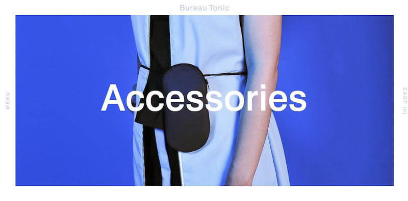
Source: Bureau Tonic
The first impression that visitors get of your website (even before they scroll through), ensures whether visitors make the choice to explore your website further. To ensure that visitors do this, you must provide content that they are interested in. So place high-quality content with plenty of white space above the "fold" of the screen.
Simplicity and minimalism are not the same thing, but minimalism should be simple. The user experience is simplified when they can convert without being distracted.
Intuitive navigation plays a big role in this. However, in a minimalist interface, this is a challenge. To keep it as clean as possible, you need to remove unnecessary elements and streamline the content. Therefore, designers often hide part or all of the navigation. A menu icon takes you to a full menu. This is common these days. Both in minimalist web design and in mobile websites. This usually does cause visitors to browse your website less. Therefore, it is important to find a good balance in this.
Example hidden navigation:
Source: Brian Hoff
Compared to this (always) visible menu bar:
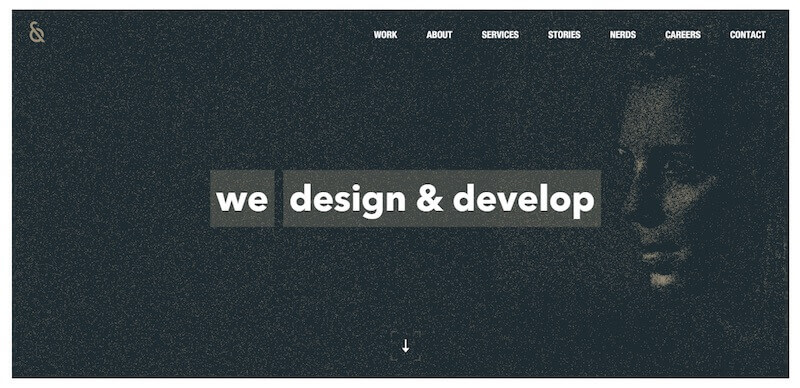
Source : Nerds
Simple navigation should always be one of the requirements of your design. When creating a minimalist website, always make sure that visitors can easily find what they are looking for.
Like any other element, animation must also adhere to the principles of minimalism: subtle and showing only what is essential.
Good UI (user interface animation) animation has two purposes: to make sense and to be functional. For example, you can use animation to save space (reveal hidden details only when people scroll over them with their mouse). The animation below allows visitors to discover more and more of the website by standing on it. This makes the user experience more and more enjoyable.
Source: UI Movement
Especially on landing pages, you have only 1 goal. The minimalist design is a must then: little content and purely conversion-oriented.
Still, the success of minimalist web design depends on the purpose of your website. Some websites and/or goals require more information. A low information density can make people want to scroll for more information. The right solution is to create a minimalist landing page with deeper pages to more detailed information.
All in all, a good minimalist web design will
How minimalist is your web design? Is it actually focused on the goals you want your website to achieve?